10.28.2011

Champagne & Candles

[Laurent-Perrier...my favorite champagne in the world]
[extra perk is that their packaging is b-e-a-u-t-i-f-u-l]


+


[up close view of package design]

[product]

[front & side view of package]

I'm a sucker for really pretty packaging.  Seriously it could be filled with air but if the cover/packaging is pretty I'll buy it.  Yes, I do judge books by their cover. Plus what could be better than pink champagne and crisp white candles...I'll tell you nothing!

10.25.2011

Pretty Packaging

[beer logo]


I thought this packaging was really fun, especially with Halloween right around the corner.  
Who knew ghost liked to drink beer?

10.24.2011

Helping Hand

I work with a wonderful non-profit organization called Support for the Kids.  One of the many charities we do is for underprivileged children and their families.  "As you can imagine, the need for basic items for hundreds of kids and their families is overwhelming this year."  I know as students we aren't always flowing with extra funds, but any type of of donation would be greatly appreciated!  

Below is a list of basic items that the families we help are in need of.  (A good way to provide for a large amount of families is to spread a dollar.  So we recommend buying some of these items at a dollar store) 
 
shampoo
conditioner
toothpaste
toothbrushes
deoderant
laundry detergent
cleanser
dish soap
combs
brushes
q-tips
body lotion
body soap
chapstick
disposable razors
gloves
warm hats
canned food
 
Also, gift certificates to: walmart, target, payless shoes, marshall's, tjmaxx, ross, gas, grocery stores,
 
We also can use new towels, blankets, hoodies and small appliances like: blenders, pots and pans, toaster ovens, microwaves and crock pots.  These items - (great prices at j.c.penny's and kohl's)  
 
i will start collecting the first of november. i can meet you anywhere with your donation. i hope to have a donated office space in wlv, so donations can be dropped off there as well.. 
 
"We (a bunch of volunteers) sort, divide and count items. We fill small laundry baskets with all of the above items and hand them directly to families in need.  These families are picked by a social worker, principal or teacher.
home visits are required to verify the need."

If anyone decides to donate feel free to bring it to me during class.  Or if you'd rather donate your time please feel free to contact me for date/time/location details.
 
ANY donation is greatly needed and appreciated. Thank you for taking the time to read this and for your consideration.


10.20.2011

Mr. Henry Wolf Ladies & Gentlemen


[henry wolf]

                 [harper's bazaar december 1958 cover]                   [show april 1963 cover]

                        [harper's bazaar cover]                           [show august 1962 cover]


Henry Wolf – Design Hero
     One of my favorite and go-to designers is Mr. Henry Wolf.  Wolf was born in 1925, in Vienna Austria.  Like many designers, he was skilled at many aspects of art such as: photography, art directing, teaching, and of course graphic design.  He is most notoriously known for being the art director and editorial designer at the following magazine companies: Show, Harper’s Bazaar (1958), and Esquire (1952). It was fellow graphic designer, Alex Brodovitch who literally handed down his art director position to Wolf in 1958. Some of his covers are literally the most outstanding pieces of work and should be viewed by all graphic designers.  A few of them I have posted to give an idea of the kind of talent this man possessed. 
     Having worked with such famous photographers as: Art Kane, Melvin Sokolsky, and Richard Avedon, not only led Wolf to open up his own photography studio in New York but also further launched these men’s careers.  Wolf was also a master at ad campaigns and directed advertisement campaigns for: Coca-Cola, Alka Seltzer, De Beers, Saks Fifth Avenue, IBM, Revlon, Elizabeth Arden, Gillette, Xerox, and Buick.  He won such awards like: the medal of the American Institute of Graphic Arts for Lifetime Achievement (1976), Induction into the Art Directors Club Hall of Fame and the Royal Society of Arts (1980), the Herb Lubalin Award from the Society of Publication Designer (1989), and a Doctor of Fine Arts by the Parsons School of Design (1996).  In addition, Wolf taught graphic design at the School of Visual Arts and Parsons School of Design.  
     Wolf’s work is along the lines of surrealist/expressionist.  The way he plays with typography is truly something to be studied, and the way he fills his space is truly inspiring.  I always see myself going back to him and other designers during this time period for inspiration in my own work. He has a style that really represents the 50's and 60's, from the color, typography, design, and everything else is so true to these generations.  Four major themes that show up in his work consistently are "art, love, time, and money."  Which are timeless themes that any designer at some point in his/her career focuses on.  A few of my favorite pieces of his, are the cover for Show Magazine with Mr. and Mrs. Kennedy’s faces making up the American flag.  The idea behind it is obvious that this family is the new America.  And the execution of having their faces make up the flag is brilliant.  It takes on a humorous tone and the colors are subdued enough to take this issue more seriously but still attract all varieties of people because during this time the majority of the country admired and wanted to be the Kennedys.  Another favorite piece of mine is his cover for the last Harper's Bazaar cover shown.  The way he styles the title of the magazines is very interesting.  Typically, for designers this is a "no, no" you don't alter, destroy or  change the read of the title.  However, I think in this instance we see Wolf do a very unique manipulation to the word "Bazaar" and it works.  I'd even go further to say that it's comical and goes well with the rest of the issue.  Unfortunately in 2005 Wolf died in New York and this world lost one of the most talented graphic designers.


Bibliography
Glaser, Milton.  “Henry Wolf.”  2011.  September 21, 2011.  <http://www.aiga.org/medalist-henrywolf/>.
 “Henry Wolf – Graphic Designer.”  2009.  September 21, 2011.  <http://www.revelinnewyork.com/blog/11/03/2009/henry-wolf-graphic-designer


10.19.2011

Rope Design

[rope]

[designing logo]

[logo]


[final package]


I thought this logo was really unique and inspiring.  The actual logo itself is made from rope
and then photographed and used as the logo for this beer company.  Just a very out of the box way 
of branding.

10.18.2011

Logo Revision-Round 2

[Revised Logo #1]

Ok, so I'm leaning towards this logo because it'll work better with my packaging and everything.  So any feedback would be greatly appreciated!

10.17.2011

Logo Revisions

[Logo option 1]

[Logo Option 2]

Thoughts/Comments please I can't pick which one should be my final.....

10.13.2011

Sketches Project #2

[Stationary Sketches]

[Packaging Sketches]

[Print Ad Sketches]

So my brand is a makeup company called Penny Lane.  And the main idea behind the brand 
is simplicity, clean, classic and to enhance a women's natural beauty with the makeup rather than
to cover it up or hide it under a ton of makeup.  I'll be posting logo revisions on Monday to give ya'll a better understanding of the look I'm trying to convey behind the brand 

10.10.2011

Loving Lowe's


I've fallen in love with this video.  It's a fun, unique take on commercializing 
a home improvement store.  The song, the dancing combined with the room changes, 
as well as the actors aging is intriguing and actually makes the viewer want to redecorate their
space and grow old with a husband and family.

10.06.2011

Vanity Fair Feeble


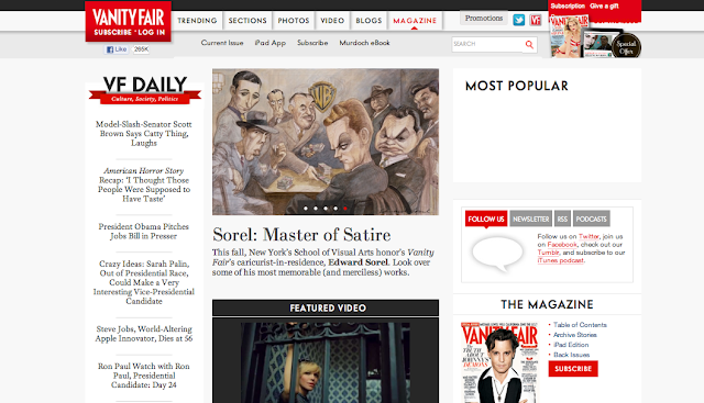
I have recently become a big fan of this magazine, along with W and Vogue.  However, Vanity Fair's website I hate.  This image is of the home page, and to me there is just way too much clutter and info to take in.  Trying to find anything in their achieve is a challenge.  The navigation bar is not a personal favorite or easy to navigate.  The entire layout is too much, you have text and images competing for your attention the minute this site is loaded.  Nothing is taking hierarchy, even the logo/brand is hidden to the left and difficult to see at first.  Generally speaking I love the color scheme and all the material they offer, I would just prefer a cleaner, simpler look.  They do a beyond fabulous job with their magazine layout, editing, and design why can't they translate that into their digital world?  Unfortunately it's websites like this that completely diminish my inspiration.  

10.04.2011

Beach Blues


Not too long ago I was begging the weather to be fall.  Now that fall has decided to show up, I find myself missing the sunny skies.  I find it so peaceful and liberating to sit on the beach, read a good book, and play around in the cold waves.  I get inspired by the consistency of the beach.  Sand and water are such simple elements of our world but yet it sparks such inspiration in people through out the world.  

10.01.2011

Officially October


Pumpkin, pumpkin, pumpkin!!  When fall starts to roll around my taste buds automatically crave pumpkin. From bread, scones, coffee anything will do! I literally could not wait for Starbucks to start offering their pumpkin spice lattes I started stalking their website till it arrived.  And I love experimenting with different foods by adding pumpkin to pretty much anything.  Last week I made pumpkin bread pudding, and then pumpkin sugar cookies.  And the other day I found pumpkin butter at Cost Plus.  I've only tried it on biscuits but so far its more like a dessert jam/butter thing than actual butter butter.  My love for this weird flavor sparks an inspiration in me for different things.  To be more adventurous and take chances.  To yes cliche, "be outside the box."